Jibran’s Perspective
How Horo timer educates users
Jul 04, 2022Horo is a simple menu bar timer app for the Mac.
I use it like a pomodoro timer, but without limiting myself to just 25m blocks. It’s a very small application, but one that provides a lot of value for my workflow.
I recently noticed the really smart way in which it trains the user in its features, and I believe it has some great lessons for software developers and UX designers.
The challenge of educating users
Educating users about your apps features is the kind of problem that is often overlooked when starting a new project. Indie developers often don’t think about it until the app is complete. It’s not something that is often seen as an “interesting problem to solve”.
Like marketing however, which is often relegated to the “boring business things to do at the end” category, user education can often have a large impact on the success of your application. If you are unable to teach users how to get value out of you application, users will often stop using it – just because they didn’t know it could solve their problem. It’s must be frustrating to hear users stop using your application because they thought it didn’t have a feature that you spent hours working on.
The usual solutions
- User guide or manual
- Walkthrough videos
- In-product walkthrough or popups (like Clippy from Microsoft Office)
All of these require effort from the user. The user has to spend time:
- Reading the manual.
- Watching the videos.
- Going through the demo.
Most users won’t want to invest the time upfront in reading the manual or watching product videos. They’ll only search for solution when they encounter a roadblock. As a side note, having a searchable manual is a must so that users can search for solutions when they want to. Product videos are worst than a manual in my opinion because users can’t skim through easily to the stuff they want.
In-product walkthroughs sound like a good idea. The user is in your application and has all the context in-front of them, so no need to jump b/w the manual and your app. Anecdotal evidence however suggests that users will usually skip demos, or forget the lessons afterwards. I honestly don’t believe in-product walkthroughs solve any problem other than discovery – you can tell users about new or unique features of you application and they might remember to use it later.
The Horo solution
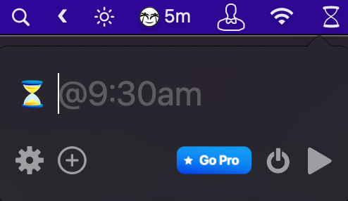
You might have noticed in the screenshot at the beginning the faded text “@9:30am”. This is one of the placeholders that you see when you open Horo from the menubar.
The placeholder is shown in the only input field that Horo has. The user has to enter the duration they want the timer to run for. Horo allows “Natural Language” input in the field. From it’s description on the Mac App Store:
Some examples of Horo’s flexible Natural Language support:
- “1:30:45” starts a timer for 1 hour, 30 minutes, and 45 seconds
- “1.5h” starts a timer for 1 hour, 30 minutes
- “45m” starts a 45 minute timer
- “1h 15m” becomes an hour and fifteen minutes
- “60s” will play a sound in a minute
- Leaving the input blank will start a stopwatch
- “@3pm” will set a countdown timer to go off at 3pm
While short, this is still a lot of possible formats. I would never be able to remember these just by reading the manual once. Luckily, Horo utilizes the placeholder in an intuitive way to educate users. Every time you open the app, you see a different example of the input formats you can use.
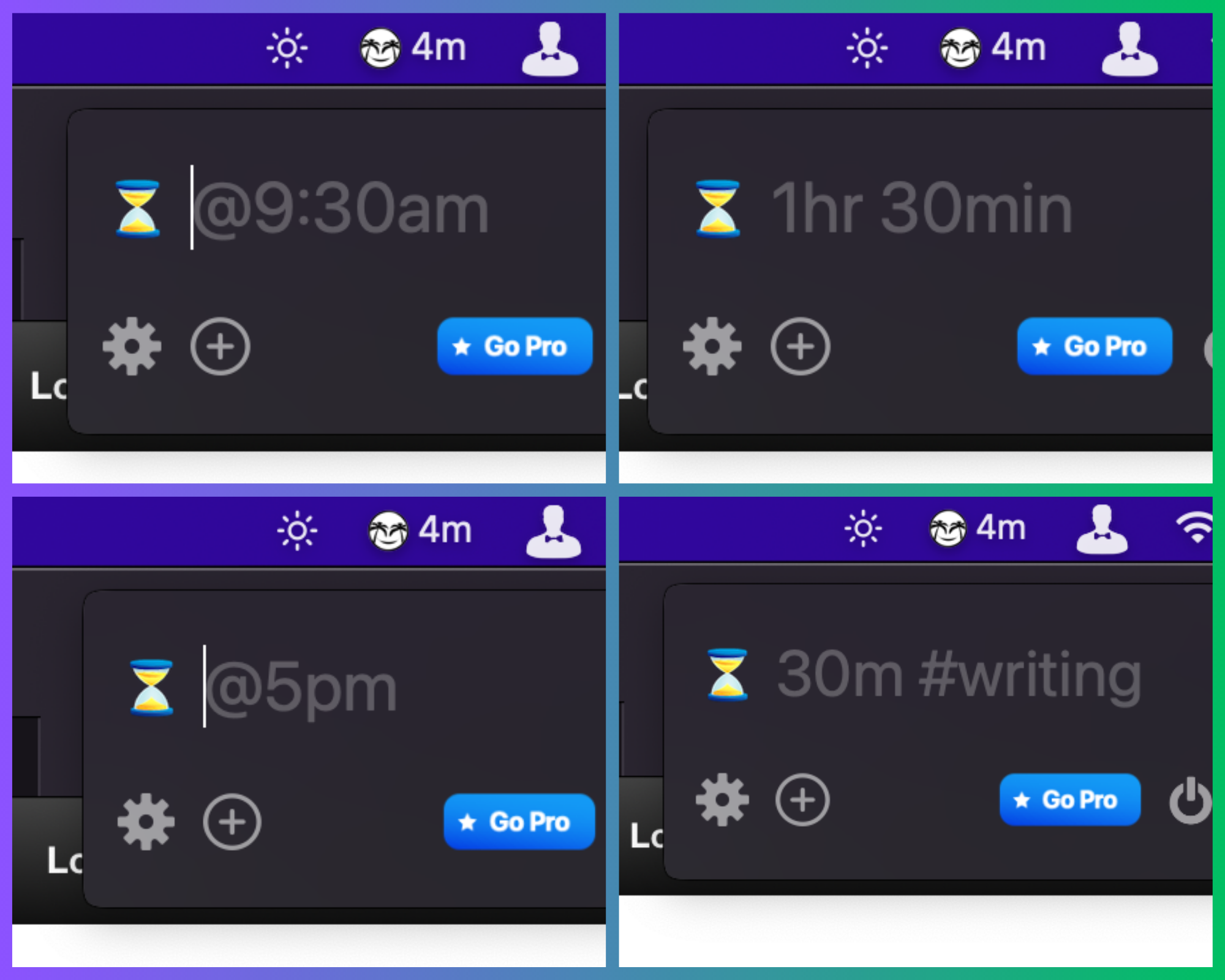
This is the first app I’ve used that I’ve noticed uses this way of educating the user. While the list of accepted formats is always available in the apps web page, presenting these formats in the placeholder does 2 things for the user:
- Automatic discovery. The user intuitively builds a sense that they can use multiple formats for the input, and are shown a different format every time which educates them on the possibilities.
- Spaced repetition. By showing the formats repeatedly, the user ends up remembering more than they would just by reading a manual once. Spaced repetition is a well researched method of learning effectively, and I think Horo uses it to it’s advantage quite well.
The takeaway
The lesson I learned is to look for these opportunities in the applications I build. A great place to educate users is:
- Where you can unobtrusively add hints on usage. The placeholder does not get in the way yet delivers the information.
- Where the user will see the hint multiple times during regular usage of the application.
Finding places in your applications where this strategy can be used might take time and some luck, but if you find these, I believe capitalizing on the opportunity will lead to a much more delightful user experience.
After all I ended up writing a whole blog post on how a simple timer app uses a placeholder. :)